graphic design catalog
The graphic design catalog was an assignment given to us within a Print Production Class. The class was split into 4 teams ( we had an uneven amount, so my team had 1 additional member ) and each team was tasked to develop, design, and produce a catalog that would be utilized to represent the program at the University of North Carolina at Charlotte.
Even though I had the biggest team, the collaboration and teamwork was not there; Unfortunately, 2 of my teammates were sick throughout the entire assignment, and the remaining two members brought little-to no effort throughout the entire production process.
the process
As mentioned before, this was a very frustrating “group” project. I had to step up and not only lead the group to success, but I designed, developed, and produced the entire pitch, whilst communicating, attempted to collaborate, and manage my team. I am very passionate about my work, even if it is just classwork. I will always put my full efforts, as I owe it to myself to do the best I can.
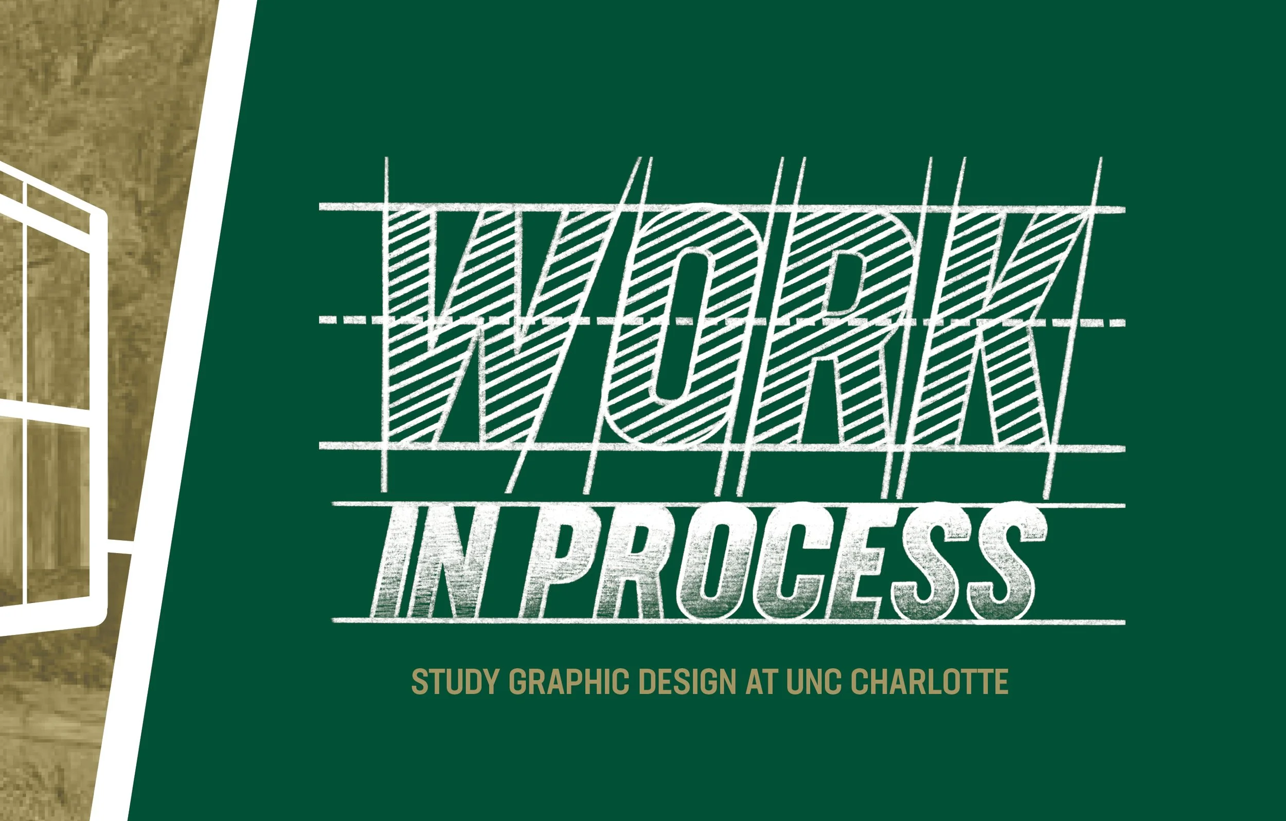
the concept
Our group chose to focus on the concept of a “Work in Progress” relating to the process of design work as a whole. Similar to the adaptation of design work, printing is also a “Work in Progress”, with different elements and problem-solving techniques working together to produce one effective composition. Our concept is demonstrated through the inclusion of CMYK components, more specifically color choice. As one flips through the catalog, black, cyan, magenta, and yellow are incorporated in the layout to emphasize our concept. There is an abundant amount of thought that goes into the process of design, which is an important aspect of design for future students to consider. Our layout and imagery also highlight our concept, showcasing students creating new pieces and representing a unique way to utilize print production.
the images
For our images, we wanted to emphasize the process that goes into design. A lot of our images are of students in the process of creating new work. Learning new information is also a part of the design process, which is highlighted in our images of different professors lecturing. Throughout the catalog, these images hint at the opportunities provided to graphic design students at UNC Charlotte. Showcasing these opportunities is not only good for students to see, but also parents and counselors as well. Images provide the reader with a visual representation of the text and overall message, which is why we spent time photographing our own photos and incorporating them in appropriate sections of the catalog.
the design
As we’re showing the process of what it’s like to be in the Graphic Design program, we’re also addressing questions of what it’s like to be a student within it. Our concept is personal, realistic, and leaves room for curiosity. We utilized graphic design elements to highlight our concept, which allows readers to navigate through the catalog. Incorporating the colors CMYK throughout the catalog allowed us to categorize each topic, while also highlighting / hiding parts that they can see if they join the program.As the book progresses, a new color is incorporated in the images and layout, until the back cover where the reader is met with a full color image of the University.
The organization of the book is designed to express the journey of the process. We split the catalog into 4 categories, 2 being more professional, while the other 2 are more personal. As a promotional catalog, we feel that we should address Graphic Design formally, but when it comes to the community found within the program, it becomes more personal. That way it can seem welcoming as well as informative. We chose to incorporate the page numbers at a large scale, which emphasizes the layering process of design. The page numbers also represent a unique, aesthetically pleasing way to design.
back & cover
page 2 & 3
page 6 & 7
page 10 & 11
page 14 & 15
page 18 & 19
page 22 & 23
page 26 & 27
page 30 & 31
page 0 & 1
page 4 & 5
page 8 & 9
page 12 & 13
page 16 & 17
page 20 & 21
page 24 & 25
page 28 & 29
the results
Unfortunately, our concept was not selected; however, my concept and design was voted 2nd place ( we lost by like 2 votes!! ). Although another team’s pitch was selected, I was very happy with the results. I felt like my hardwork was validated and appreciated by my peers in the class. The time I dedicated for this pitch was definitely worth it and it sharpened my skillset in leadership, project management, design skills, and production skills. Now with that selected, the final part of this assignment is to take the voted design and individual compose our own version utilizing its concept and elements.